Framing the problem
To give a distinct experience, I approached the project with a user-centered mindset. The problem appeared unclear at first, but by deconstructing it, I averted any scope creep that I might face.
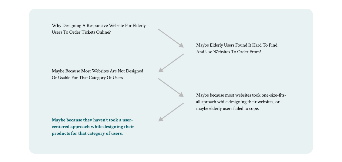
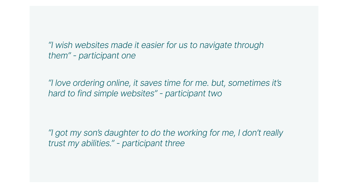
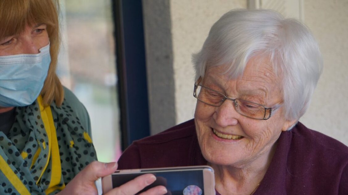
Holding some questions to ask, I went asking representative end users to know their weaknesses, struggles, and relationship to the problem. Interviews showed that many seniors lack familiarity with technology, which derived from the absence of openness they had compared with other generations.
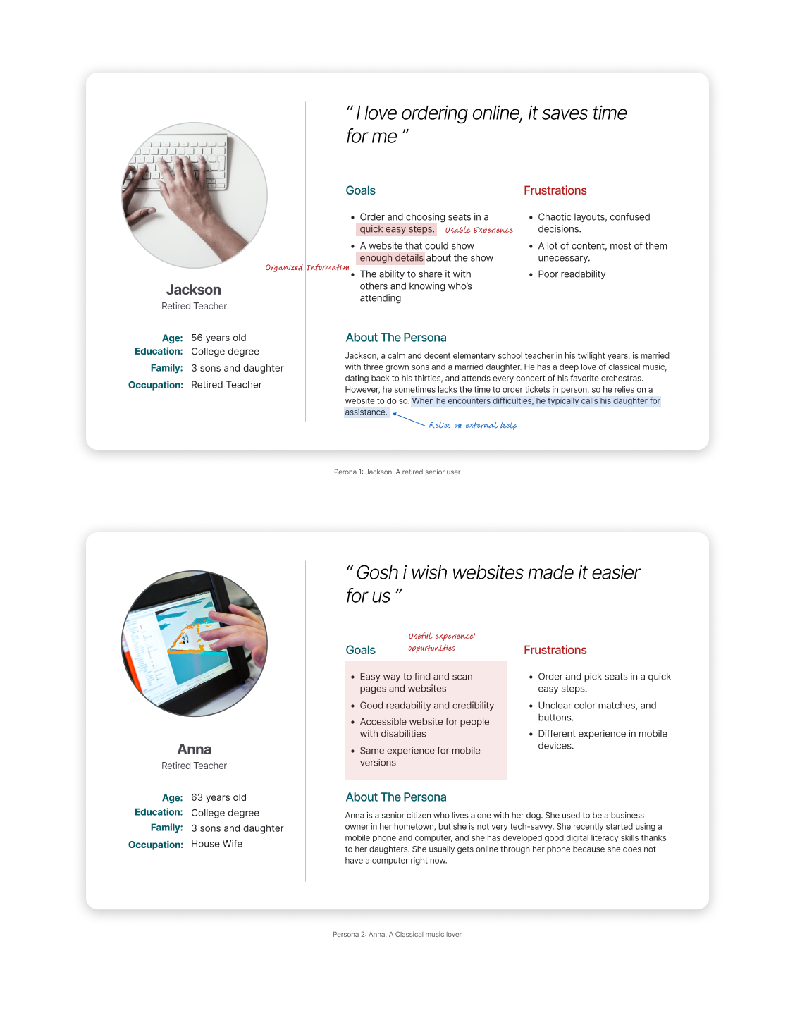
Adding another round of secondary research, I landed on some data and themes that resonates with what the interviews revealed. Therefore, I created fictional personas to reflect and personify my users to ignite empathy and understanding. I learned that the majority of seniors’ pain points came from existing products and websites that failed to meet the needs of that group of users, I scaled my investigation to see how existing ordering websites are failing to meet those needs.
I searched for direct and indirect competitors inviting the question of how did they meet or failed to meet senior users’ needs while ordering online. I picked accessibility, UI’s complexity, and support & help as my north star in comparing websites to better help draw conclusions and insights.
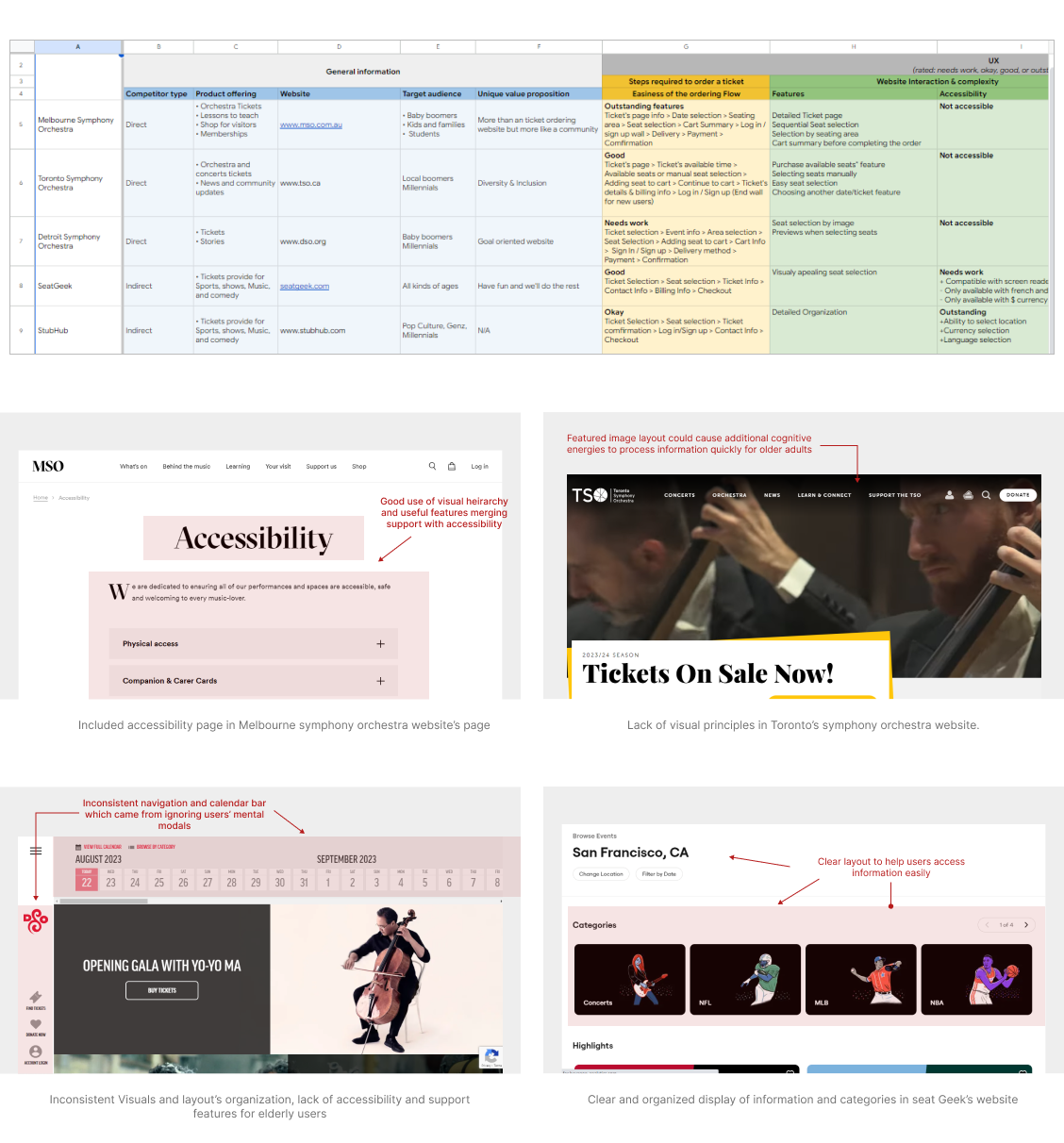
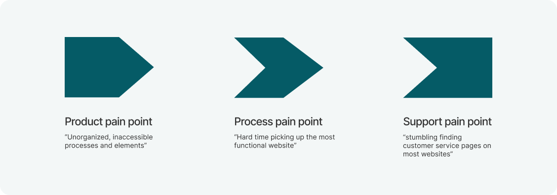
From both positive and negative aspects of websites, it became evident that the older population encounters diverse pain points other than familiarity. Physical and cognitive limitations and security concerns are among the leading causes of how seniors fell to cope with technology. Therefore, I grouped major struggles into UX pain points I could tackle.
“Therefore, I created fictional personas to reflect and personify my users to ignite empathy and understanding.”
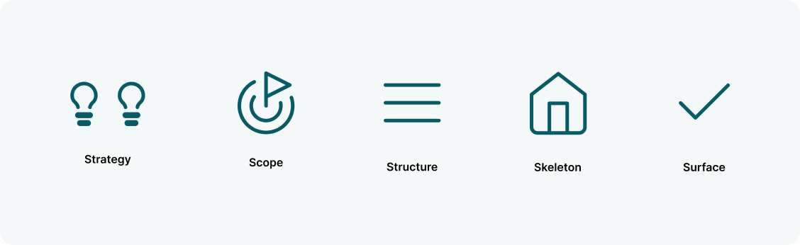
The 5 elements framework
Having pain points in place, I approached my design process with a question of how can I make the ordering experience functional and easy to accomplish. I relied on the 5 elements framework as an outline that would help me turn issues into responsive website.
In defining the strategy, the goal was to meet users' and business needs. I went to put all objectives in one place. I played the role of an official product that was going to enter the market.
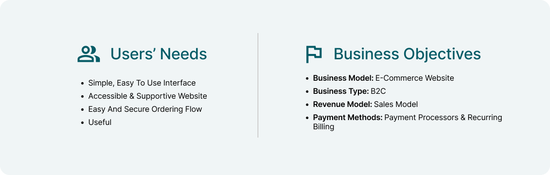
To design a user-centered product. And to be perceived as useful. I held different ideation sessions about features, functions, and possible mediums that could help users accomplish their tasks.
Help senior and older adults to select and order orchestra tickets online by providing an accessible, intuitive responsive website with an easy to accomplish ordering flow.
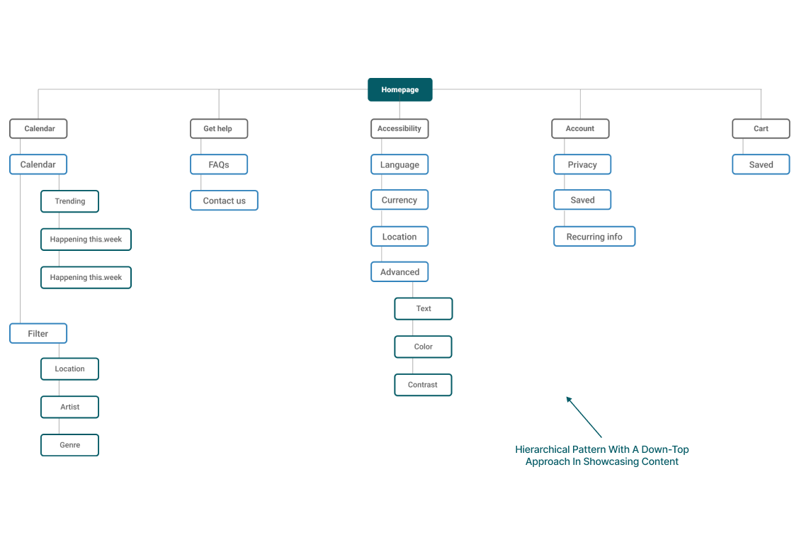
Keeping users’ mental models, ergonomics, and factors, I focused on the interaction and the architecture of information. I structured the website, organized data, and sketched how the interaction going to be by anticipating potential edge cases.
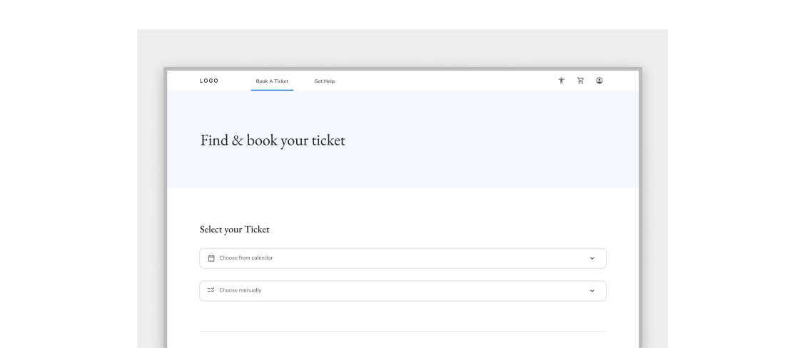
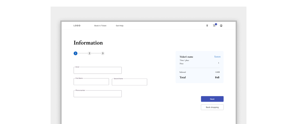
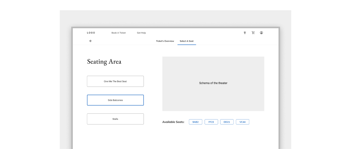
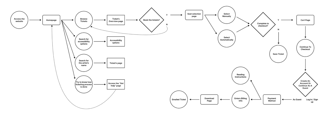
User flow of ordering ticket + edge cases
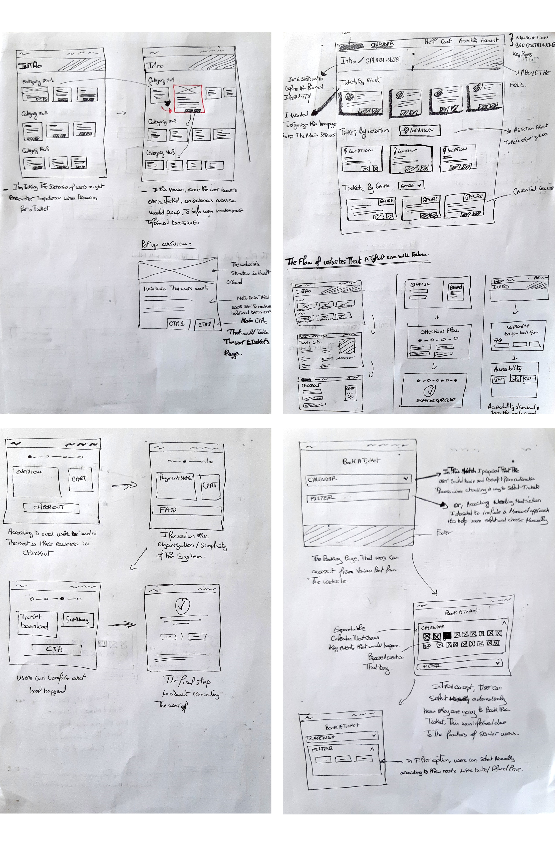
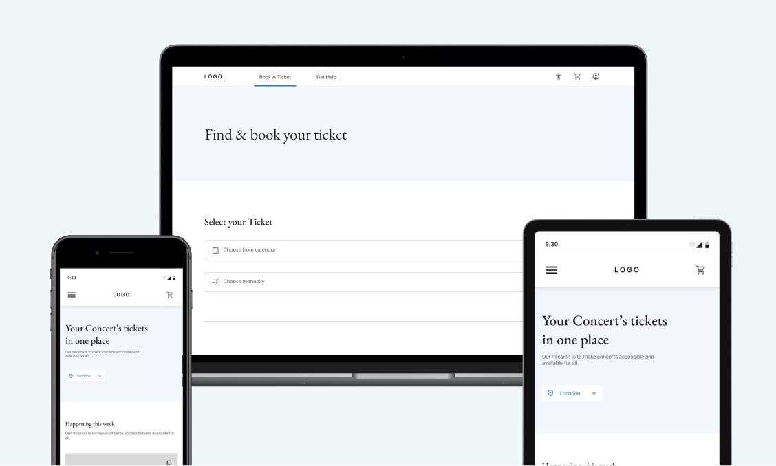
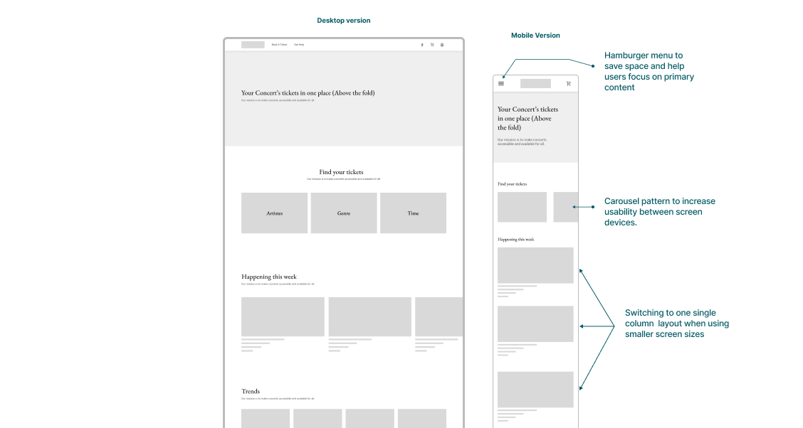
As the product started to shape, I held numerous wireframing sessions translating how the product might look and how elements could fit together. I kept the usability across platforms and screen sizes as my end point which helped me select adaptable elements and layouts that could fit for multiple platforms
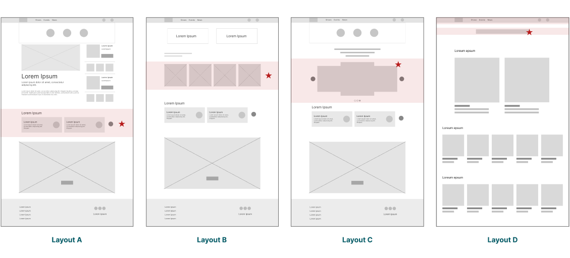
Selected Layout
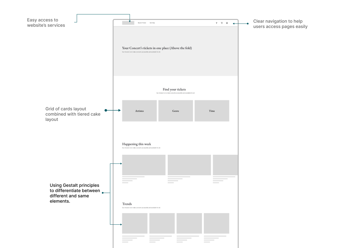
Responsive Layout
Ideating UI elements
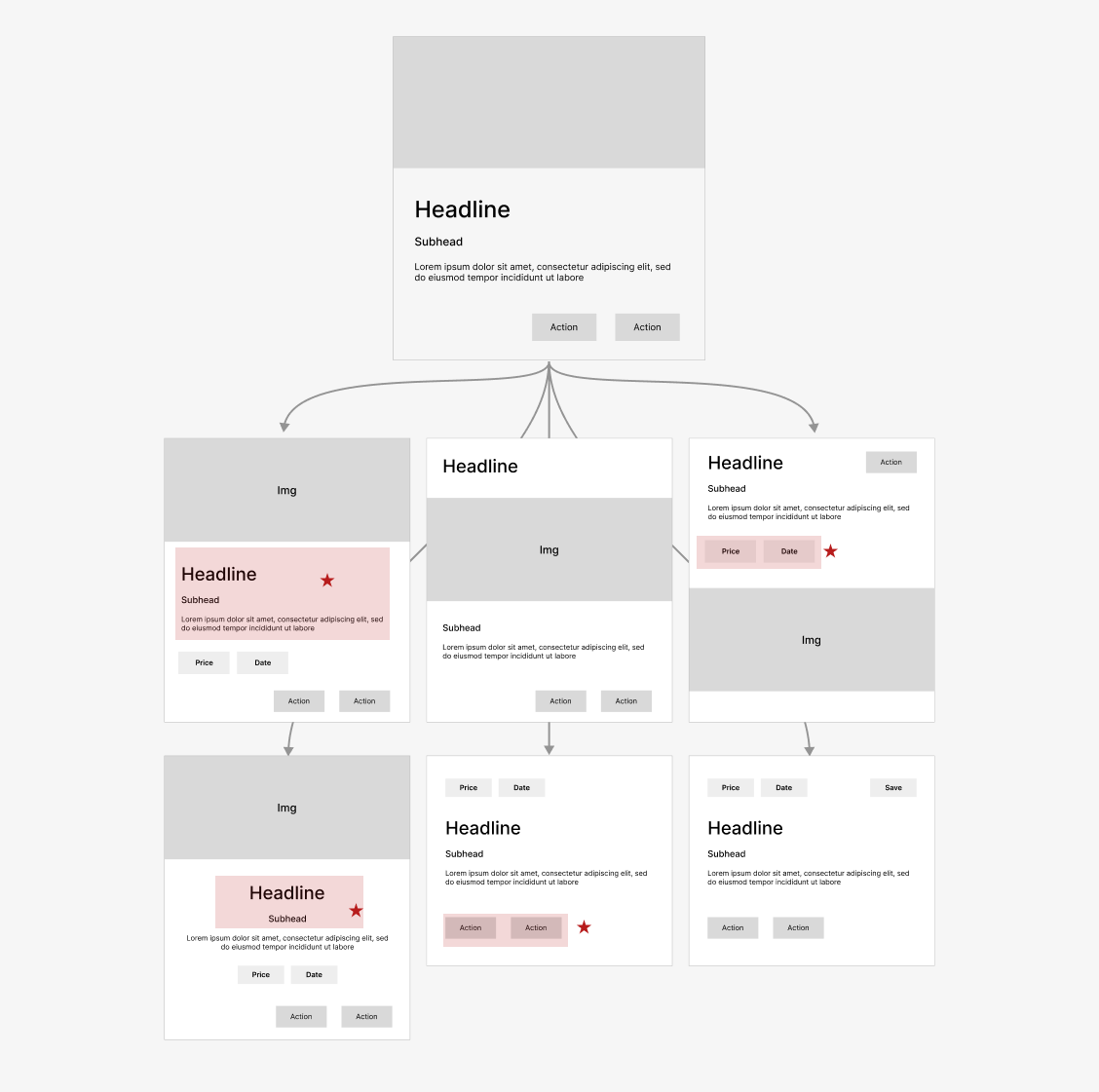
Finally, I had the challenge of picking the proper typeface, the fitting color, and how icons could communicate with users. By navigating complexity, I relied on design systems to include suitable UI elements and to convey the brand’s identity.
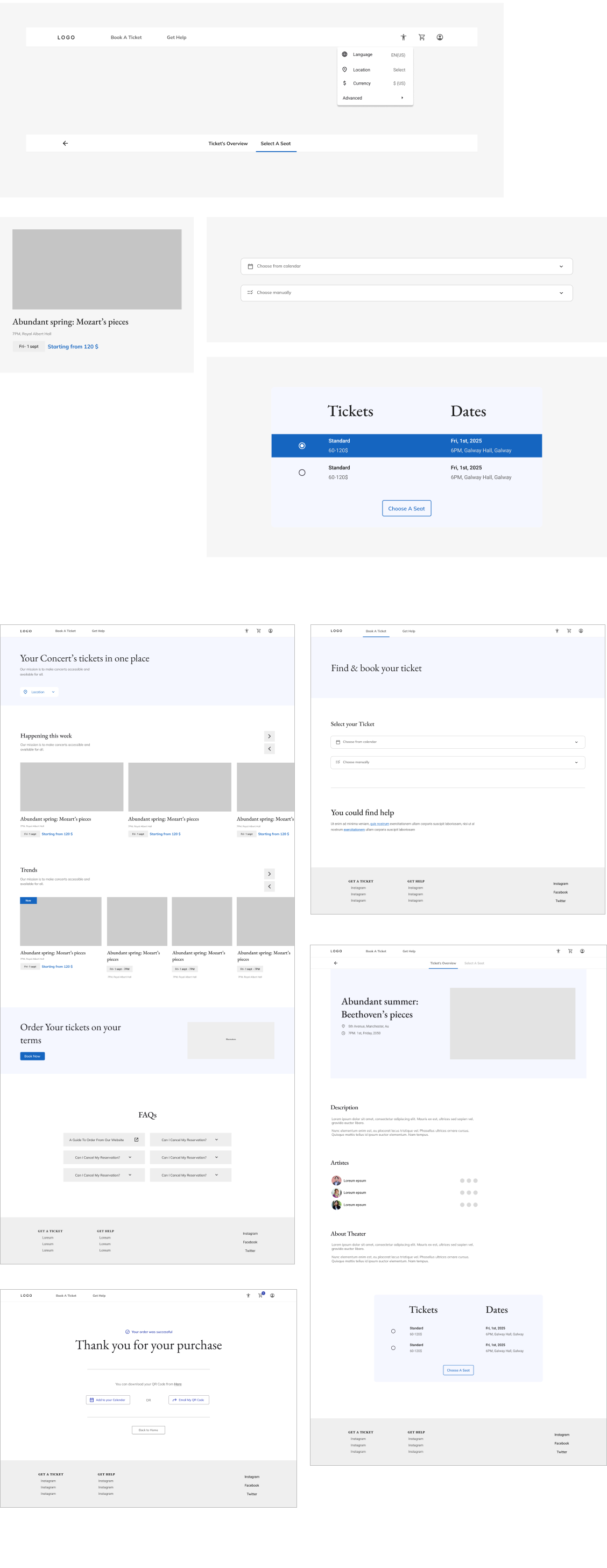
Evaluation
As a designer, I needed to evaluate if my solutions solved users’ problems. I knew I needed a post-launch research method and KPIs to see if the product was experienced as usable. thus, I created a high-fidelity prototype to communicate and collect feedback on.
Final Solutions
As a user-centered process, I needed to evaluate if my solutions solved users’ problems. I knew I needed a post-launch research method and KPIs to see if the product was experienced as usable. thus, I created a high-fidelity prototype to communicate and collect feedback on.