In this six-week project from the Google Certificate Program for Social Good, I worked as a UX generalist leading the research in the strategy phase. I then became an interaction designer, turning complex problems into easy-to-use products.
Design an app for first-generation immigrants to socialize and become more productive and included in their communities.
Local is an application that allows users to access quality information, participate equally, and find and connect with other immigrants and social networks.
Upon receiving my prompt, I was cognizant of its complexities. Therefore, I deconstructed the prompt into tangible subproblems, which I tackled by establishing research goals.
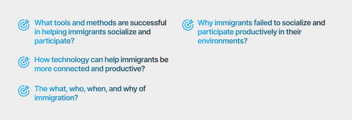
To tackle the complex problem, I prioritized gathering data to establish a strong foundation for primary research. Leading the research phase solo, I employed nine diverse methodologies to thoroughly address each aspect of the prompt and meet my research objectives.
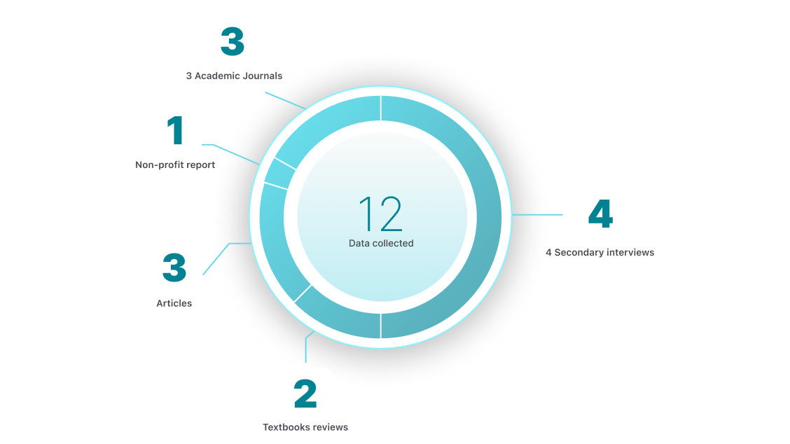
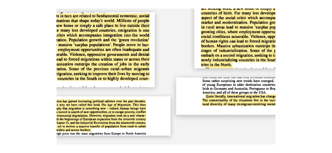
I began by delving into my topic, immersing myself in two textbooks to grasp the intricacies of immigration and its drivers. Through this process, I discovered its historical roots spanning from earlier epochs to contemporary times, primarily driven by economic inequalities, political tensions, environmental shifts, and demographic disparities.
To keep my data diverse and quantifiable, I went searching for numbers and figures about who immigrates, where they go, and what they do after?

Insights
To bridge the gaps in my research, I sought qualitative insights to foster empathy with users and understand their pain points deeply. This process revealed a spectrum of emotional experiences for immigrants, including excitement, anxiety, and hope, which can occur before, during, or after the immigration journey.
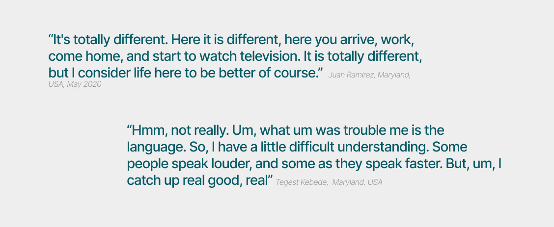
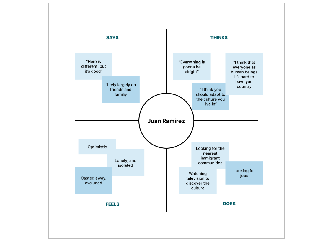
I turned interviews into empathy maps to bridge assumptions and users' realities, aiming to understand their needs implicitly. These visualizations showed that initial excitement may fade over time, replaced by heightened anxiety and fear as immigrants adapt to a new country.
With my data-filled notebook and problem-solving biases, I organized information to identify recurring themes. Summarizing these into actionable user stories, categorized by goals, needs, and characteristics, guided my design journey.
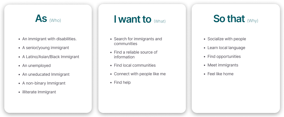
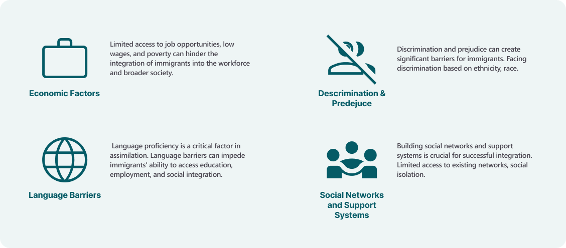
Unraveling user stories revealed key pain points hindering full assimilation for immigrants, turning challenges into opportunities for user enhancement.
To translate opportunities into solutions, I knew that I needed an adaptable, user-centered goal to follow. By developing a design brief, I was able to trade off between what’s best for both the user and the business, keeping potential constraints in mind.
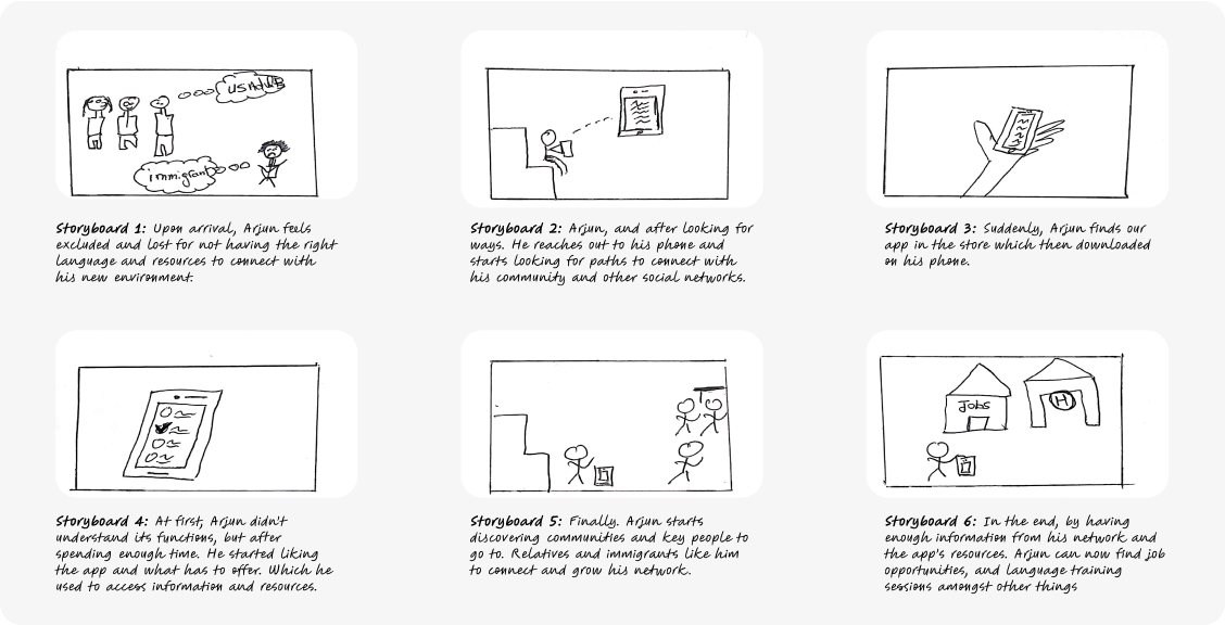
Being as generative as possible, and taking users’ stories in mind I went envisioning a journey of a fictional hero “Arjun” on how he navigated his challenges, how was his reaction, and how he found a solution. This helped me communicate my ideas to collect feedback on in future steps.
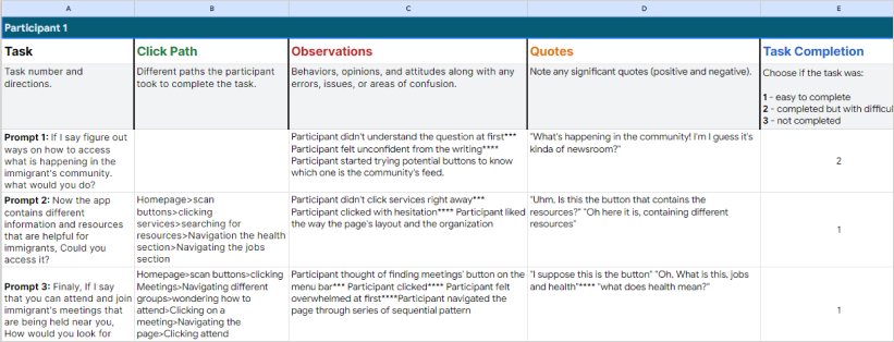
I held numerous testing sessions to make sure my concepts are useful and usable. I took a lean approach in designing my solutions. I kept receiving feedback as my only informed decisions to make, and concluded with final concept testing focused on evaluating understandability, organization, and usability.
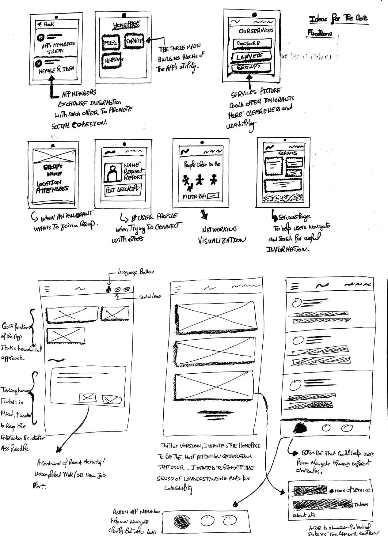
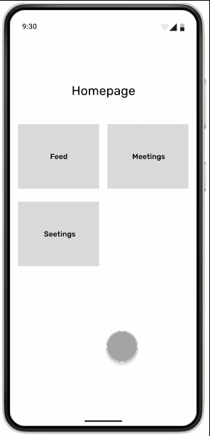

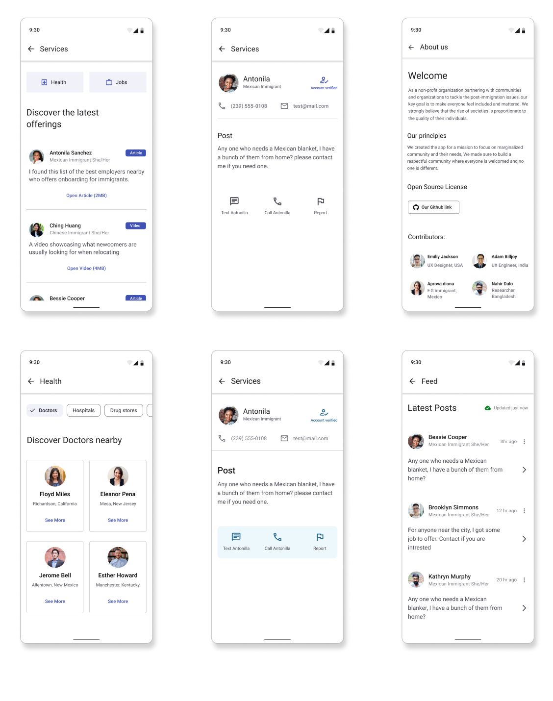
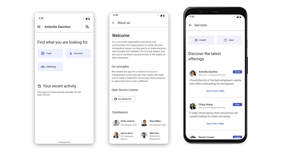
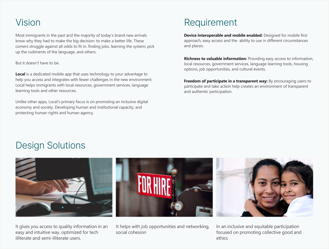
Local’s main facets were around satisfying users’ needs and solving pain points first and foremost. Local support immigrants to access information, break language borders, browse job opportunities, and join support networks.
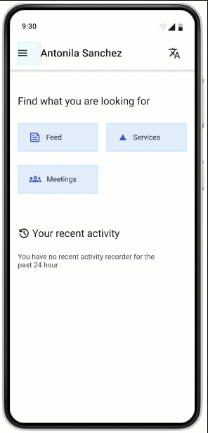
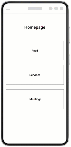
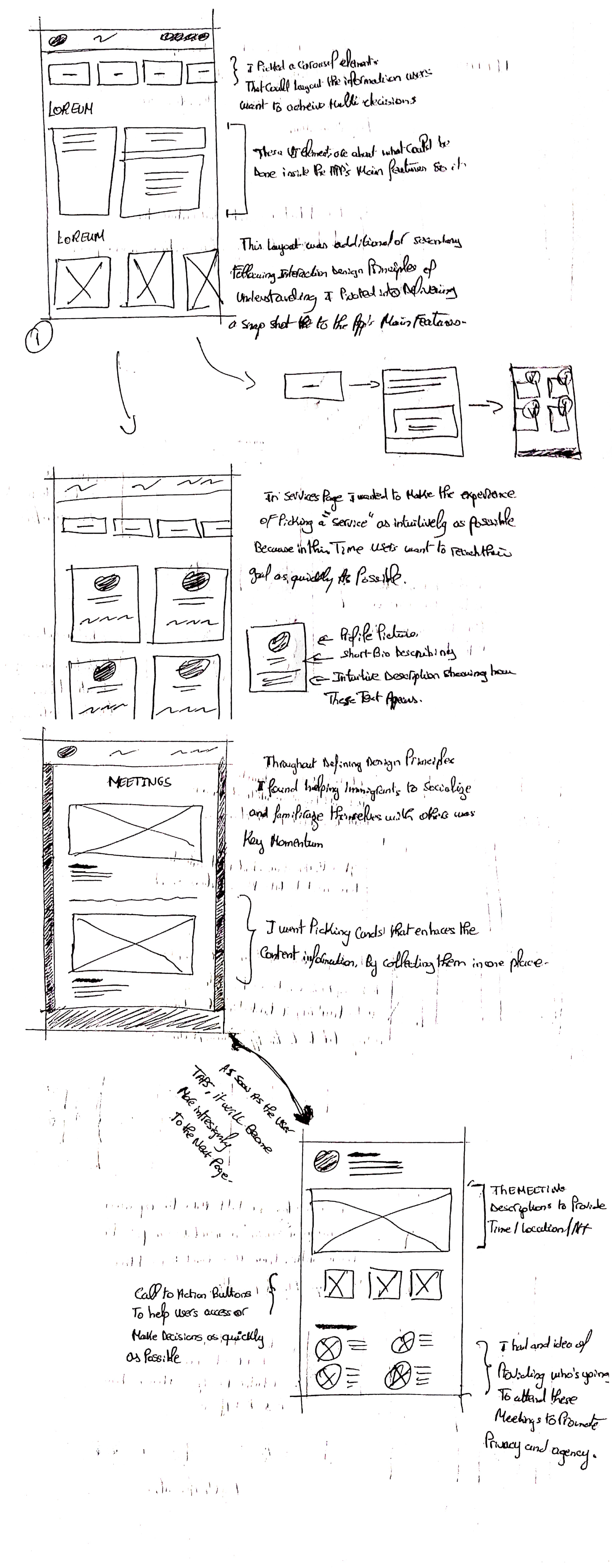
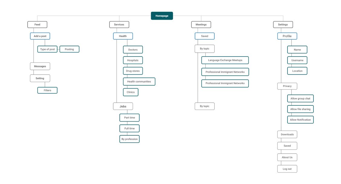
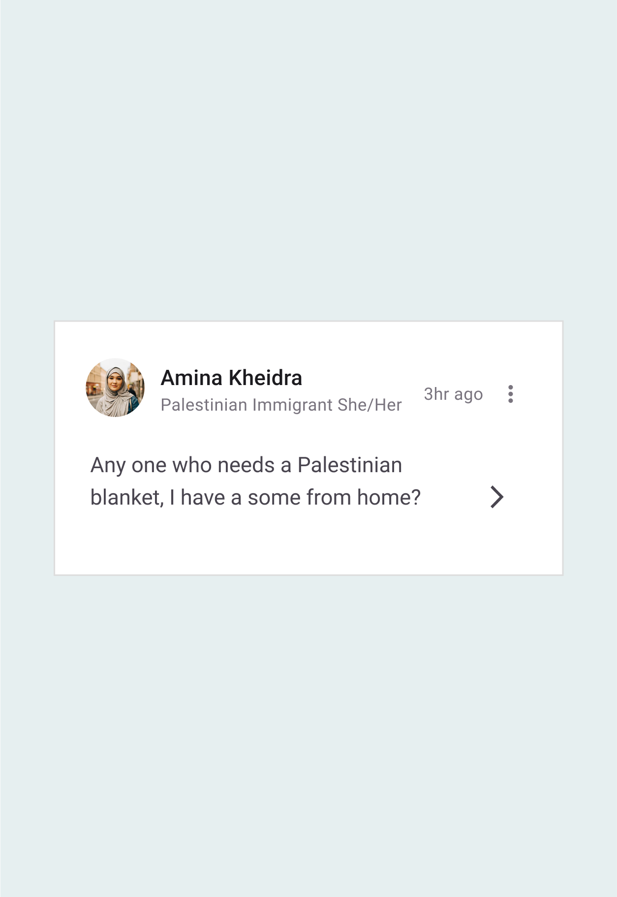
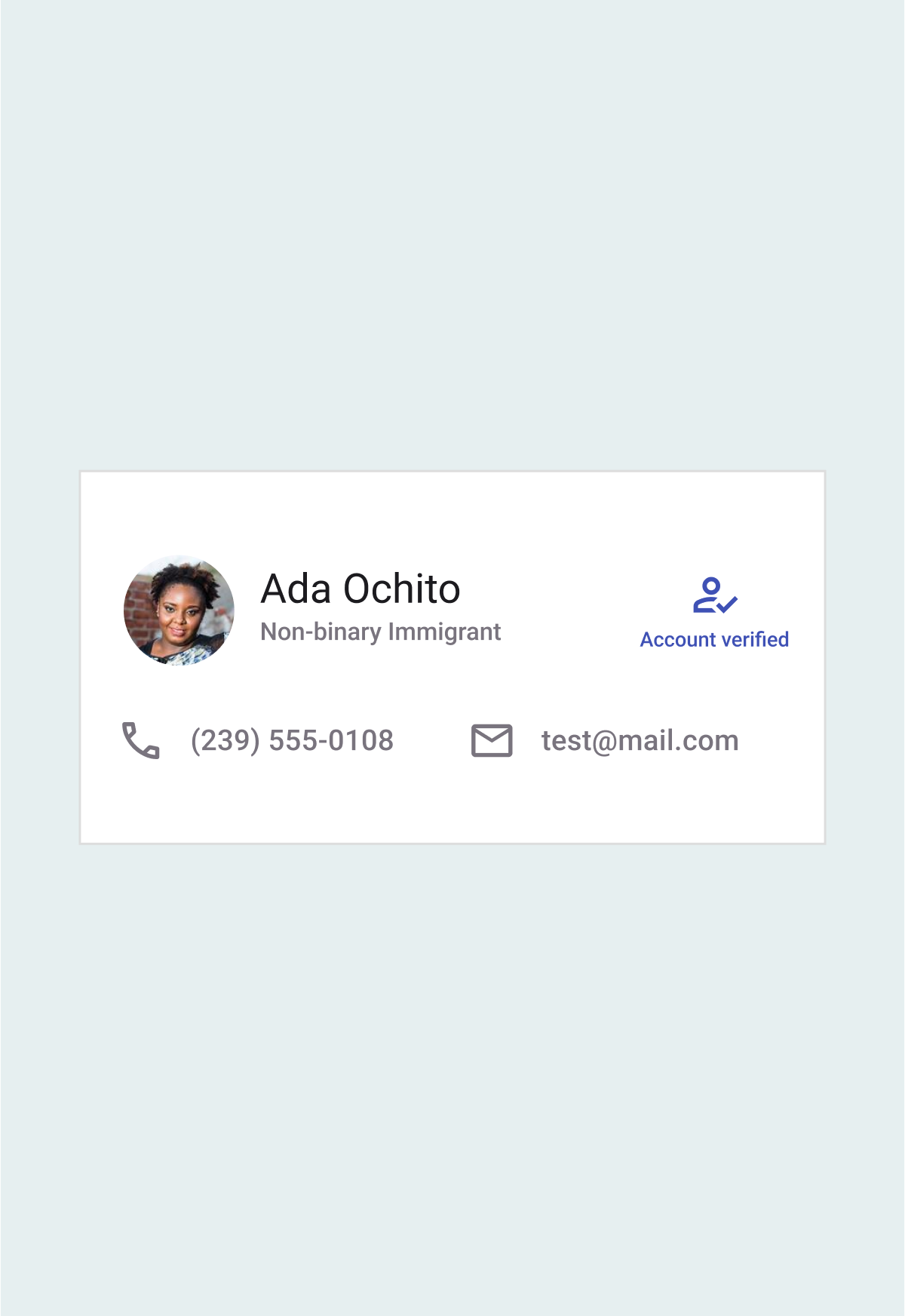
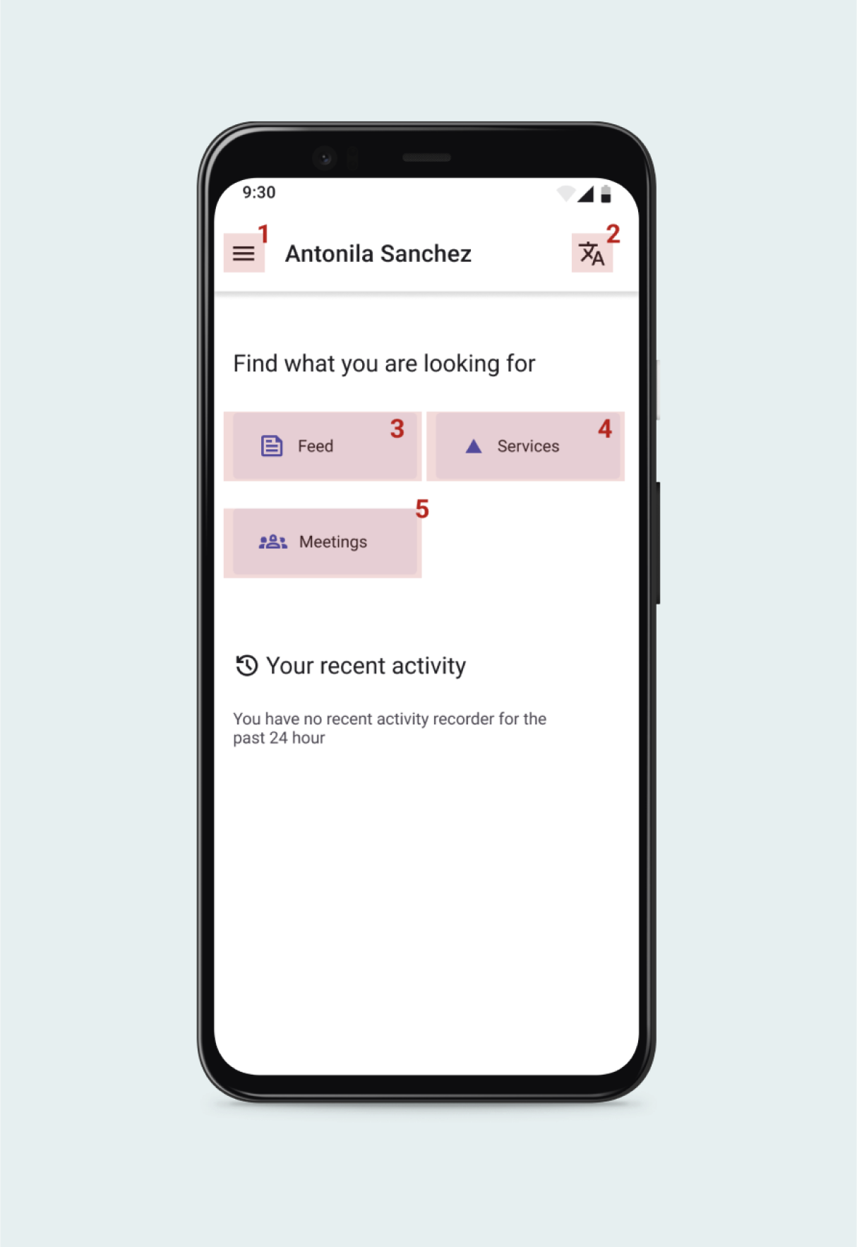
With the feed page, users can access the community’s news, postings, and up to dates from other verified members. The goal of the feed page is to help the user have reliable information and to expand and foster a network of connections through providing members contact info.

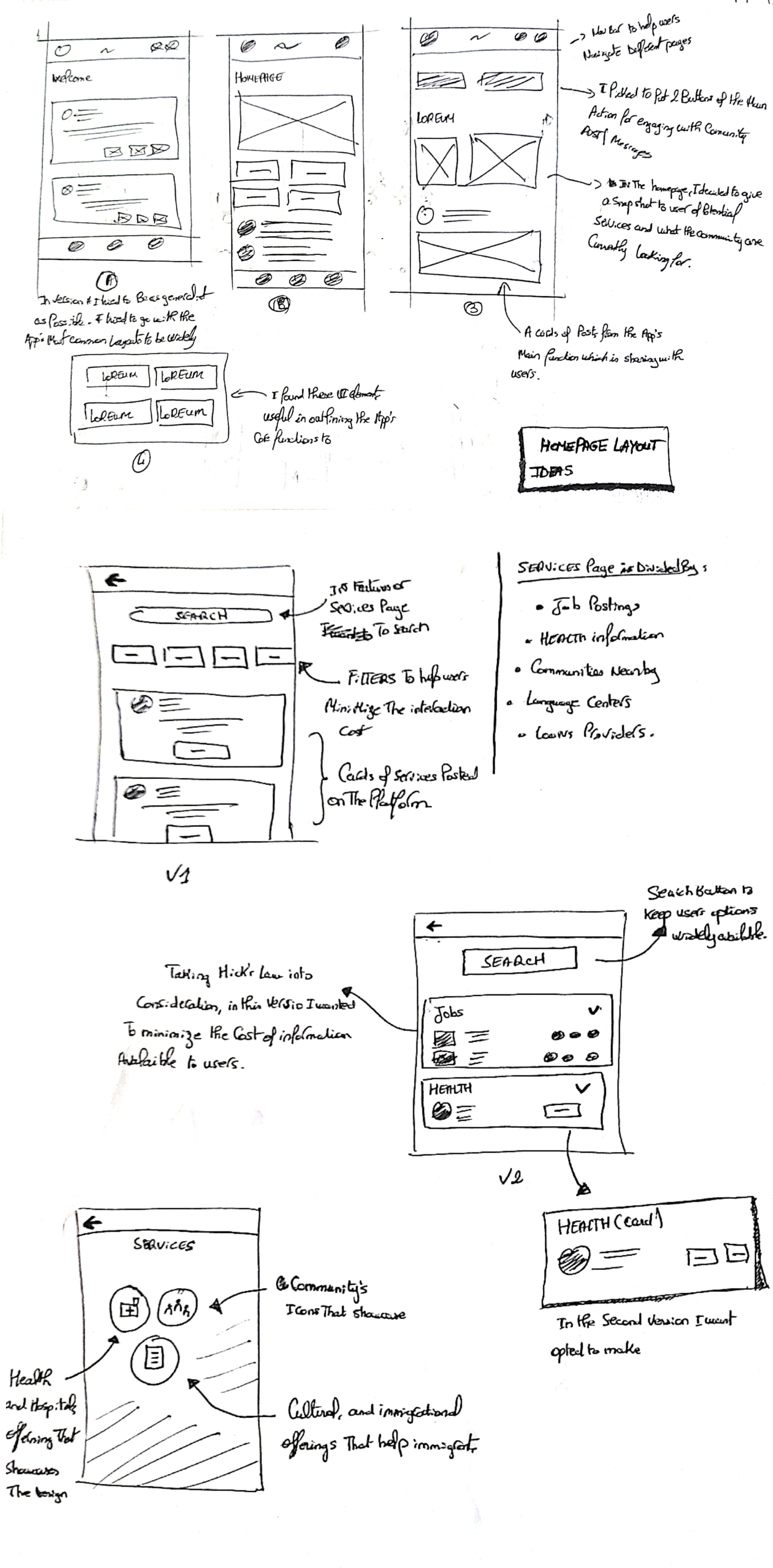
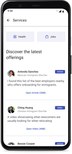
Services page gives immigrants the opportunity to navigate, search, and discover opportunities that are available. By focusing on the page’s organization, Users can find jobs, health, and other future services which I prioritized according to my users’ stories.
in the meetings page, I kept social cohesion and physical interaction as a north star. Research revealed that immigrants might experience feelings of exclusion and loneliness. Promoting meetings and gatherings that will be held was my goal with the meeting page.
Local uses a universal design language to help increase the app’s usability, understanding, and completing tasks as easily as possible. With planned structure and organization. The app promotes findability and smooth conversation between the system’s behavior and user’s behavior.
I tried to keep the layout’s space used only by necessary elements, I went with a homepage to enhance the user’s understanding of the overall system and to discover the app’s information and where it’s located.
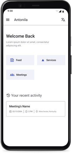
I focused on keeping the interaction between the user and the system as easy as possible. The app provide recent activities to help users know and understand where they lef off and to be aware of what is possible.
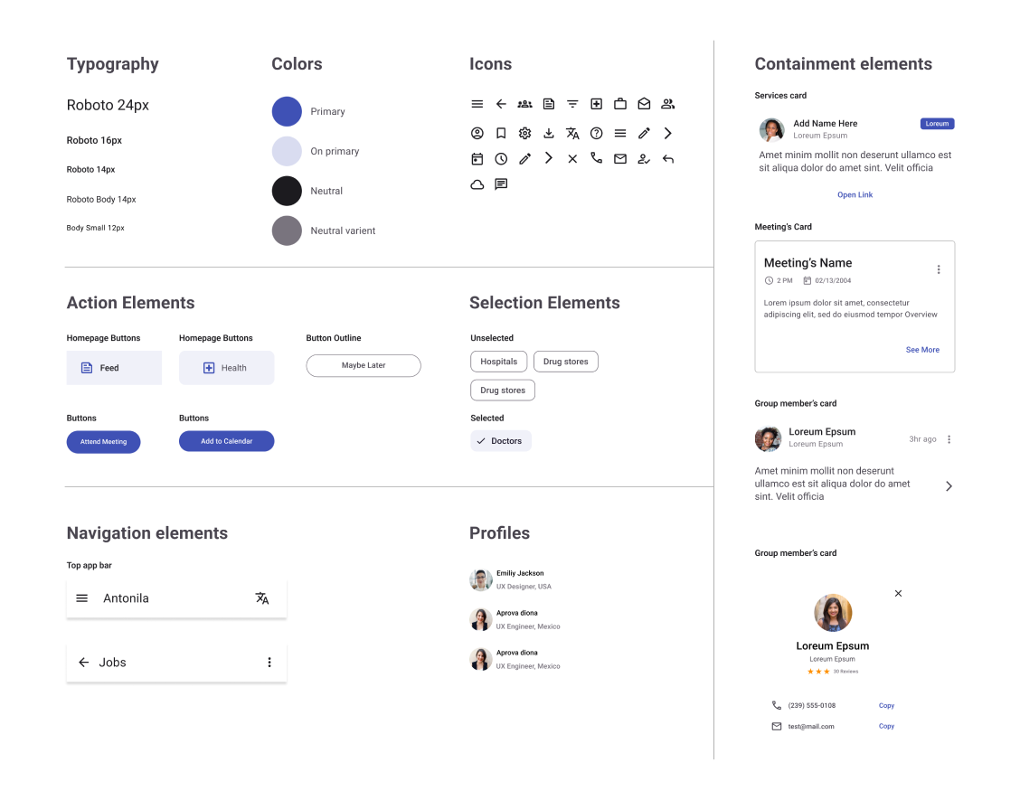
In displaying information, I focused on using cards to contain content and actions for a single topic. I focused on keeping relevant and actionable information easy to scan and read. I focused on the hierarchy and users’ attention.
As a core mission to drive social good. local was built upon a principle of equity and accessibility. where the product could be accessed through a diverse set of abilities and backgrounds. Promoting users’ agency, action, and access is a building block for designing a product for all.
Transparent representation for all members to promote a feeling of belonging.
Full access to reliable information.
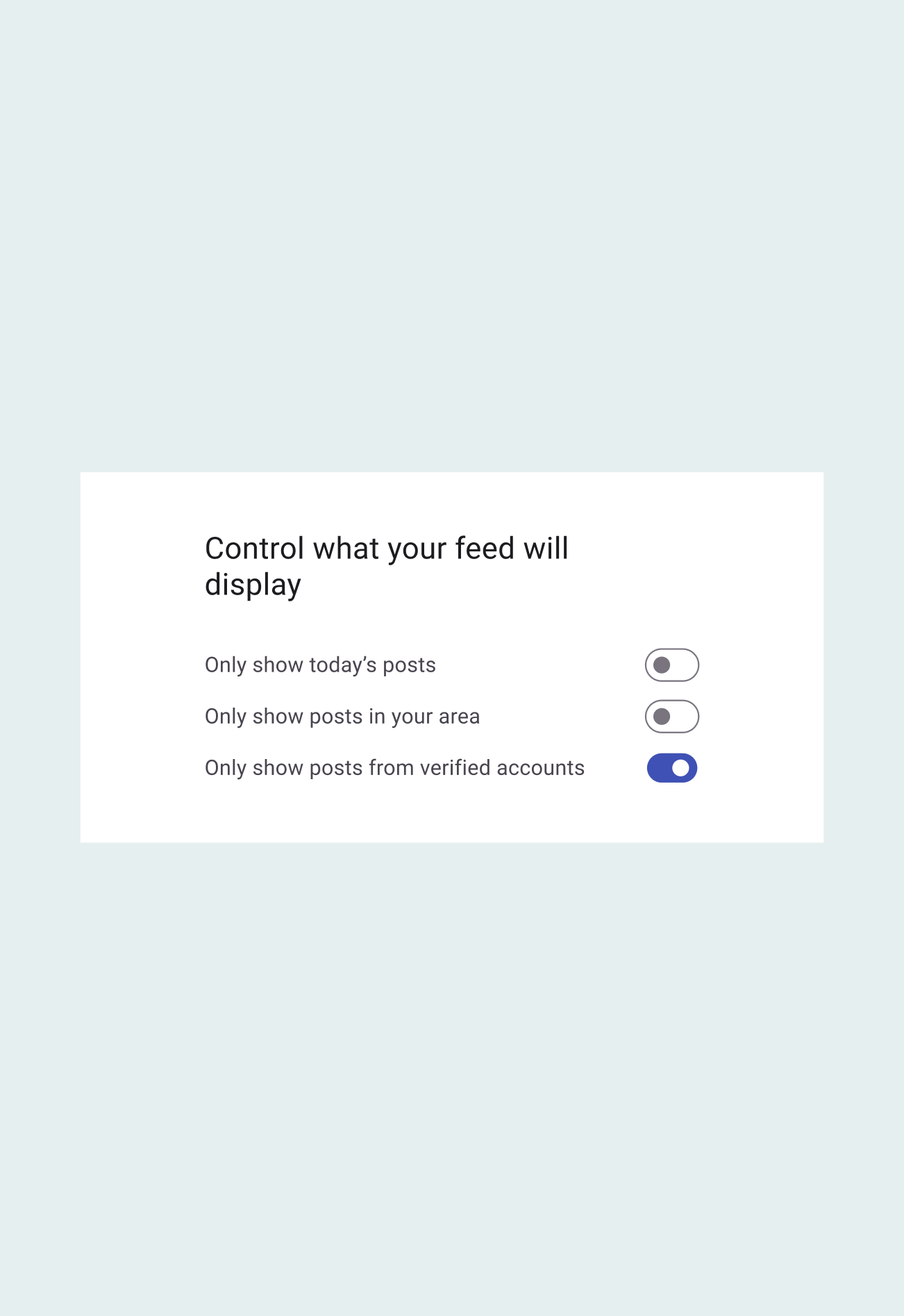
Full control over app’s features with moderated options.
Available and optimized for edge cases and offline use.
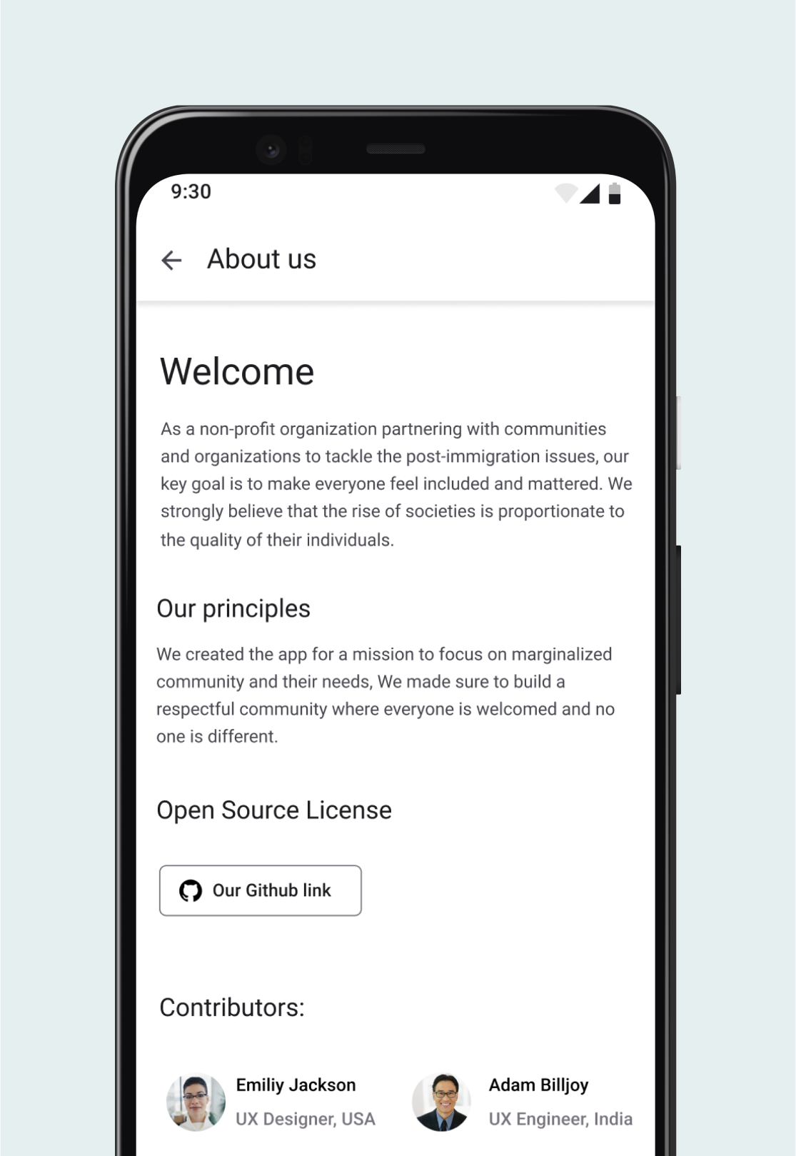
Providing the ability to contribute and discover the app’s goals and decision makers.
Designing for disable users first.
To foster collaboration and provide an easy hand-off for potential implementation, I documented my component in a sticker sheet to help for future efforts and cross collaboration. I included a final prototype to bring many voices and perspectives about the project.
Collaboration is essential, for designers are often blinded by their biases and assumptions during advanced design stages. This project taught me to gather feedback early by sharing, testing, and communicating with others to draw informed conclusions.
The design process is nonlinear, varying across projects depending on problem type and users. Designing for equity and social good challenged me to use design frameworks as inspiration to translate ideas into actionable solutions, requiring a lean and adaptable approach to benefit both user and business.
This project ignited and affirmed my passion for solving complex problems with easy-to-use solutions. Empathizing with users' needs and struggles to create understandable and discoverable solutions will always be my passion.
